The value of a systematic approach becomes clearer when inefficiencies in the process are more visible. For us, this happened when we switched our main design tool from Sketch to Figma. Sharing a single file among all designers made previously hidden inefficiencies in collaboration much more apparent.
Find out previous attempts
While preparing to build the design system, we discovered that there had been several previous attempts to create one at Envato. To avoid repeating the same mistakes, I first investigated why these attempts were discontinued.
What we learned from the previous attempts are:
- Design and development should collaborate from the very beginning.
- A design system is not a project; it's a product for products. Like any other product, its quality doesn't matter if it's not being used.
- There's no one-size-fits-all solution. The scope and structure of the design system should be tailored to the organisation's needs.
- Focus on practicality first; formality can wait.
Setting up the environment
The first thing we did was separate the draft and the actual library file. The draft file is where designers explore different solutions, while the library file is used in production.
 Library files
The draft file can quickly become messy without structure. However, we didn't want to impose too many rules, as this is meant to be a safe space for experimentation. We decided that three steps—Inbox, Review, Archive—would be sufficient.
The Inbox section is where any designer can create a page to explore ideas or test potential updates. The Review section is for designs currently under review by either designers or developers. Finally, the Archive section is where we keep all records, regardless of the outcome of the ideas.
 Library file structure
The library file has a simple structure because designers don't need to open it directly. They can access its contents in their design files through Figma's shared library feature.
Systemic Typography
While maintaining the existing font sizes, we aimed to address several issues with our typography setup:
- Text sizes are tied to document semantics.
- No clear rules exist for text properties other than size and weight.
line-heightandletter-spacingare defined in pixel values, making them difficult to scale.
 Font size
 Letter
spacing
 Font weight
 Line
height
Line
heightMore technical details are in this article I wrote, but basically the solutions we came up with are:
- Separated text sizes from the semantic structure.
- Set up just enough constraints for text properties.
- Relative values for
line-heightandletter-spacing.
 Text presets
Core components
Although the way we organise components may vary slightly depending on their purpose, having consistent organising rules seemed necessary to improve long-term management efficiency.


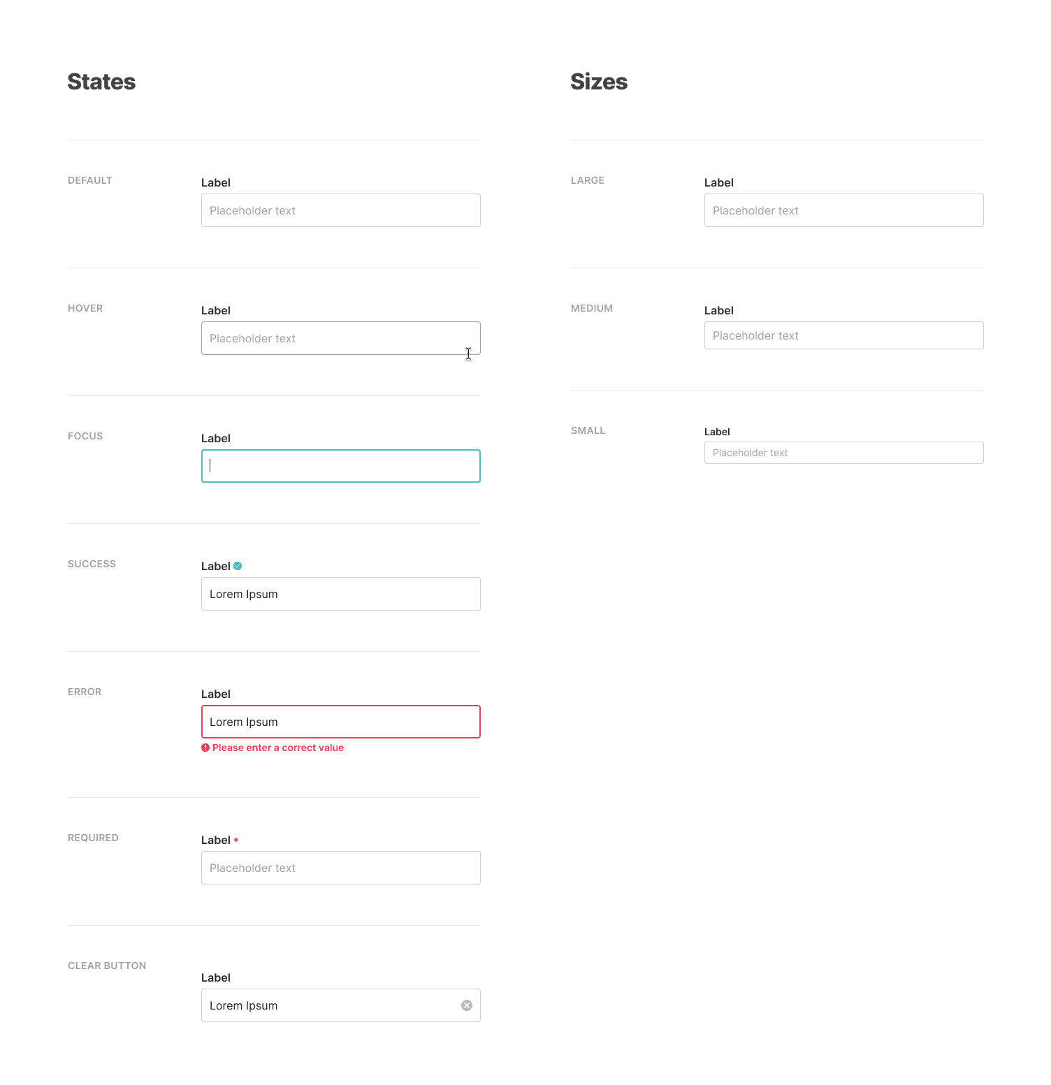
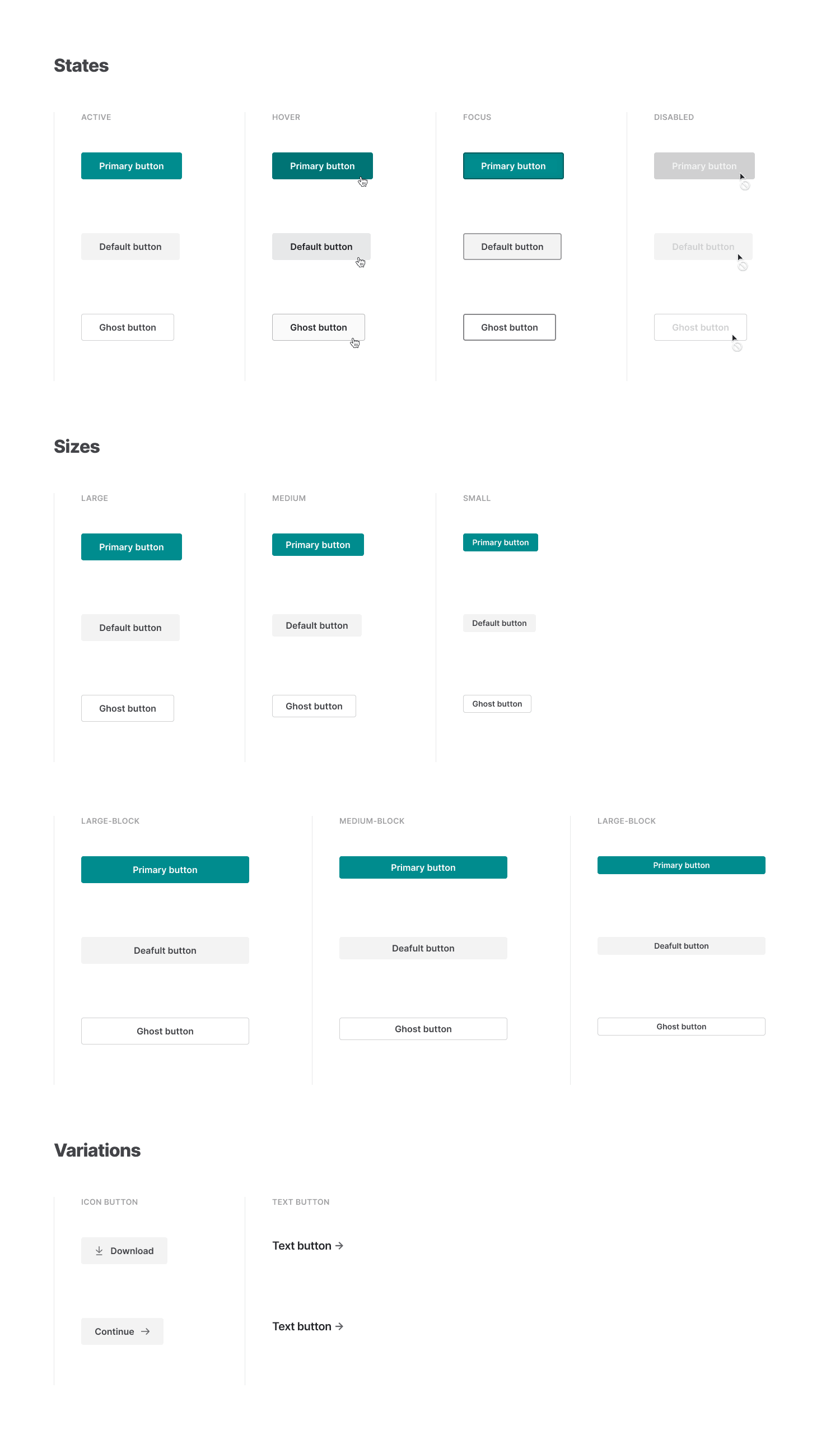
We began with buttons and input fields, classifying them by states, sizes, and variations.
Documentation
As of February 2020, the documentation website is in development, and I'm primarily working on it alone. I'm building it with Gatsby and using MDX (Markdown + JSX) for content writing.
 Documentation website
In my opinion, MDX is ideal for writing design system documents. The ability to import React components into a Markdown file opens many possibilities for creating better documentation.