Email design is often perceived as simpler than webpage design due to its usual simplicity. However, it can be trickier to execute correctly. There are numerous limitations in email development, which impose many design constraints.
Many companies rely on email as their primary communication channel with customers. Maintaining consistent email designs can be challenging, especially when different departments create new emails for various purposes.
 Re-designed email
Design process
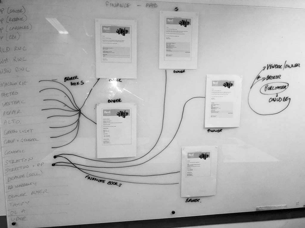
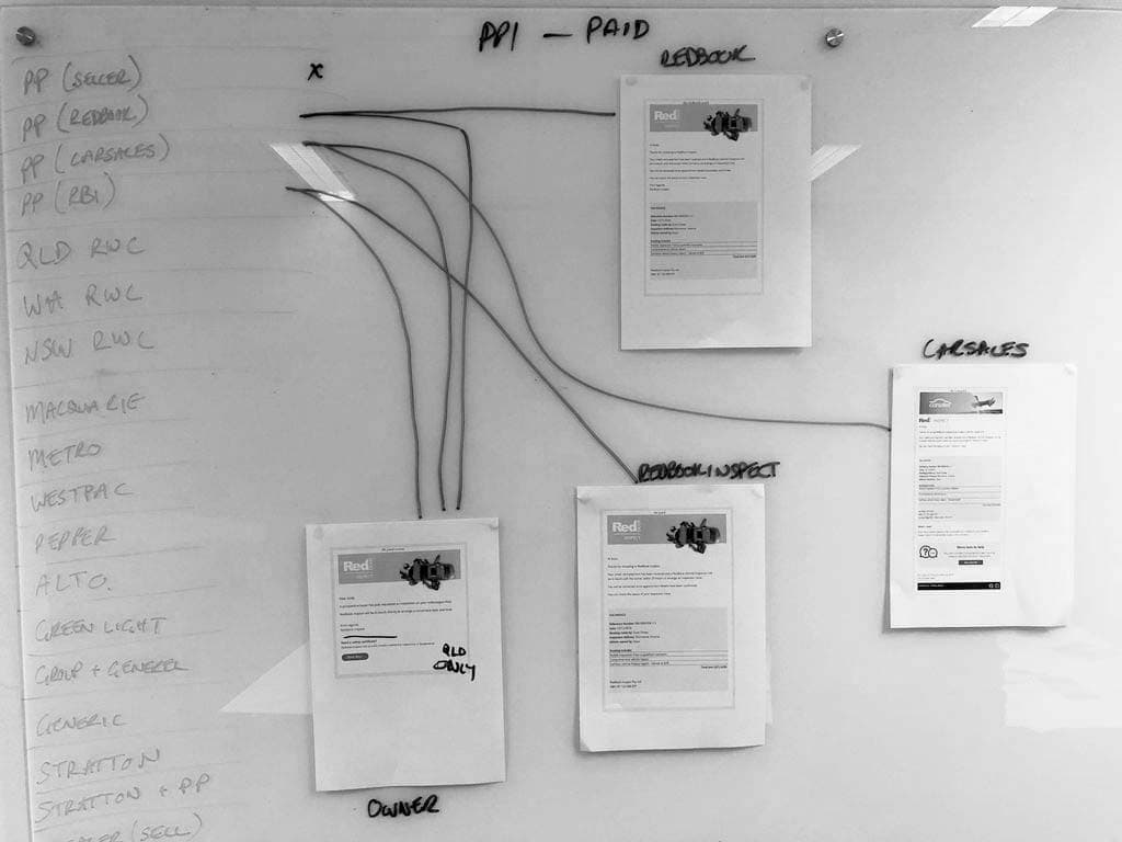
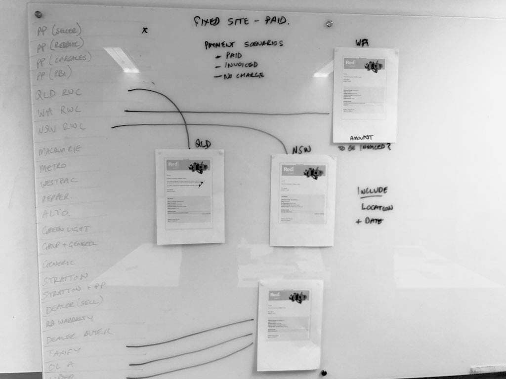
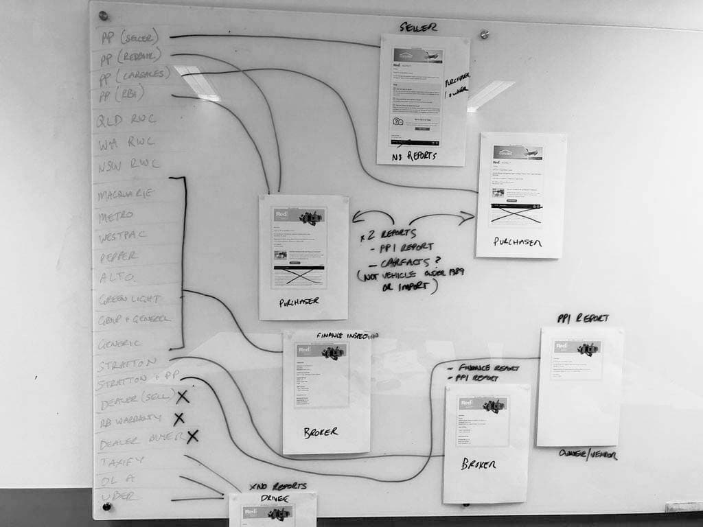
RedBook Inspect had numerous email templates with minor differences, so redesigning each one individually wasn't efficient. Instead, we gathered all the existing emails and laid them out on a whiteboard to visualise their flow.
After the whiteboard session, I wanted to set up a digital space to continue the discussion. After some research, I found Milanote, which is a planning tool for creative projects, having many features we could use to replace the whiteboard.
 Overall email flow
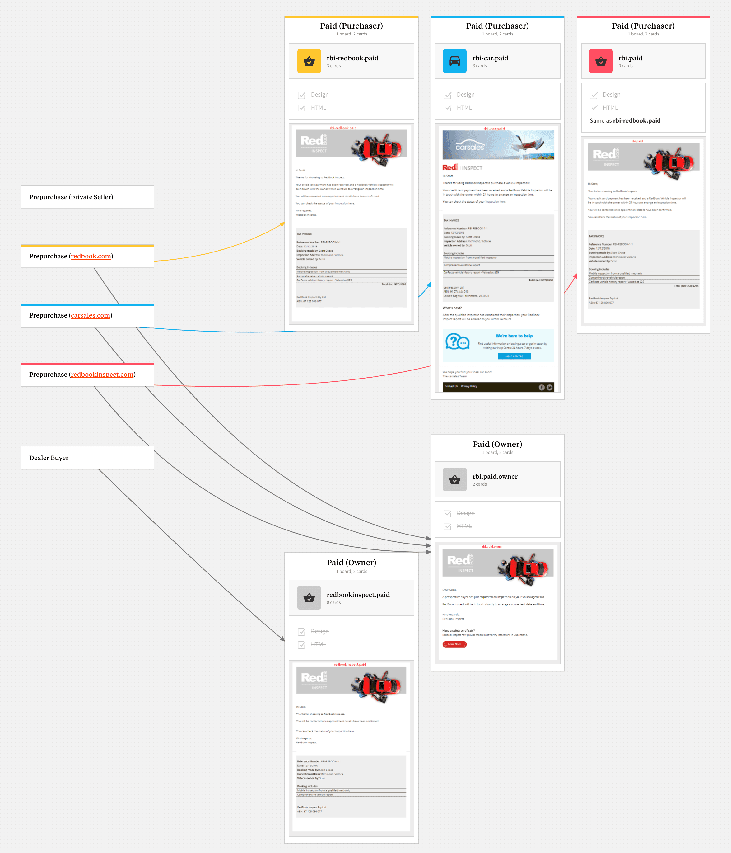
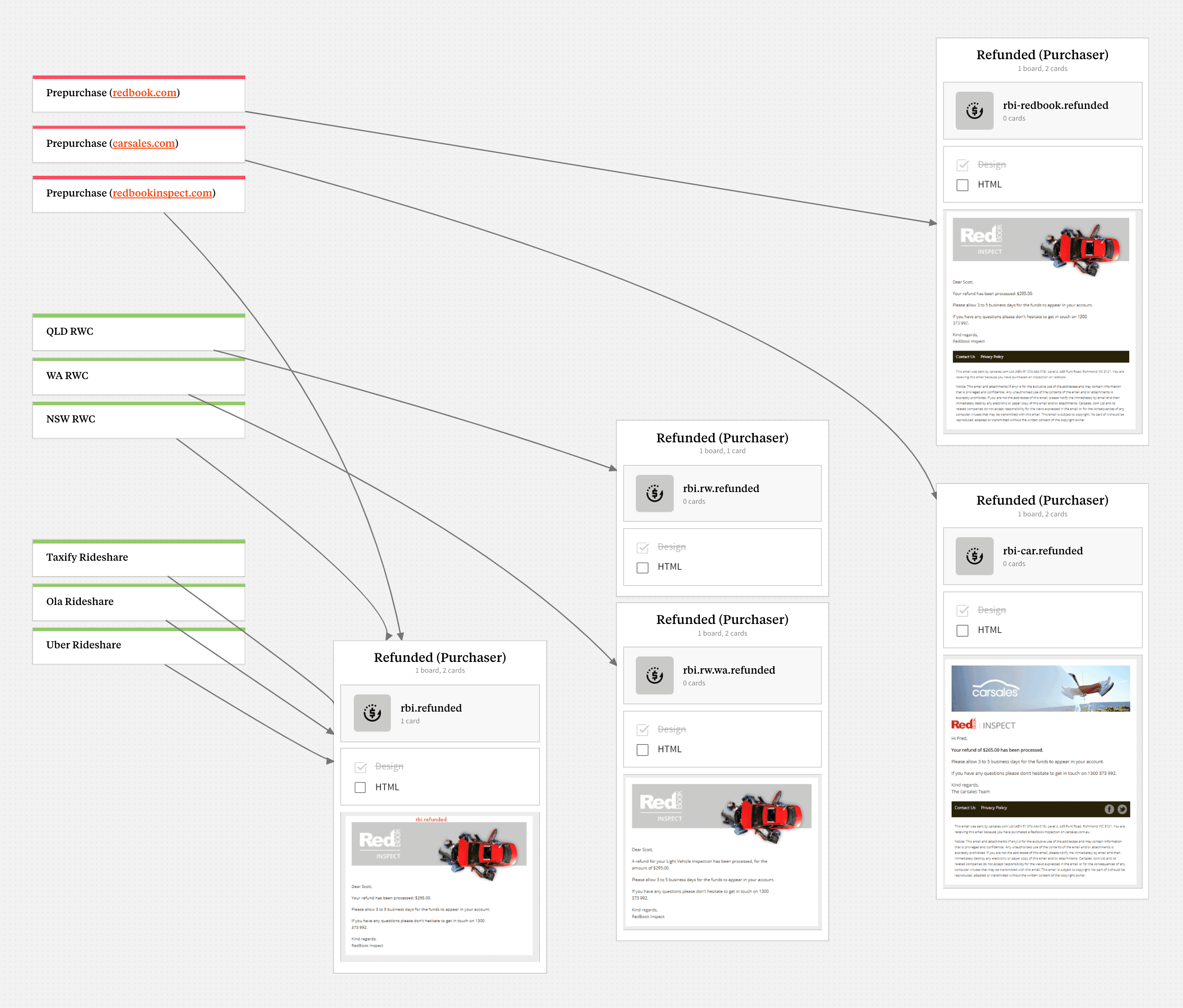
After the whiteboard session, I wanted to create a digital space to continue the discussion. After some research, I discovered Milanote, a planning tool for creative projects. It offered many features that could replace the whiteboard and facilitate our ongoing work.
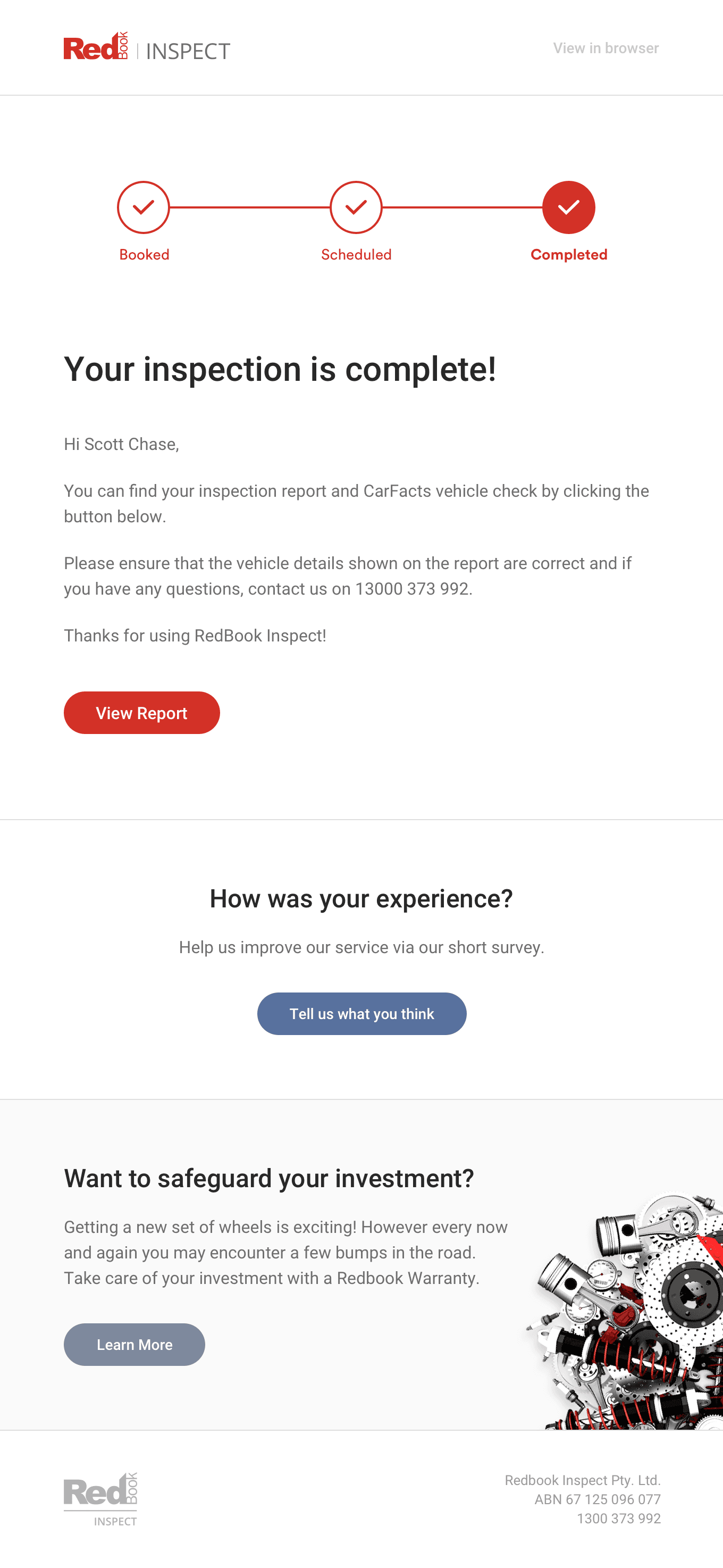
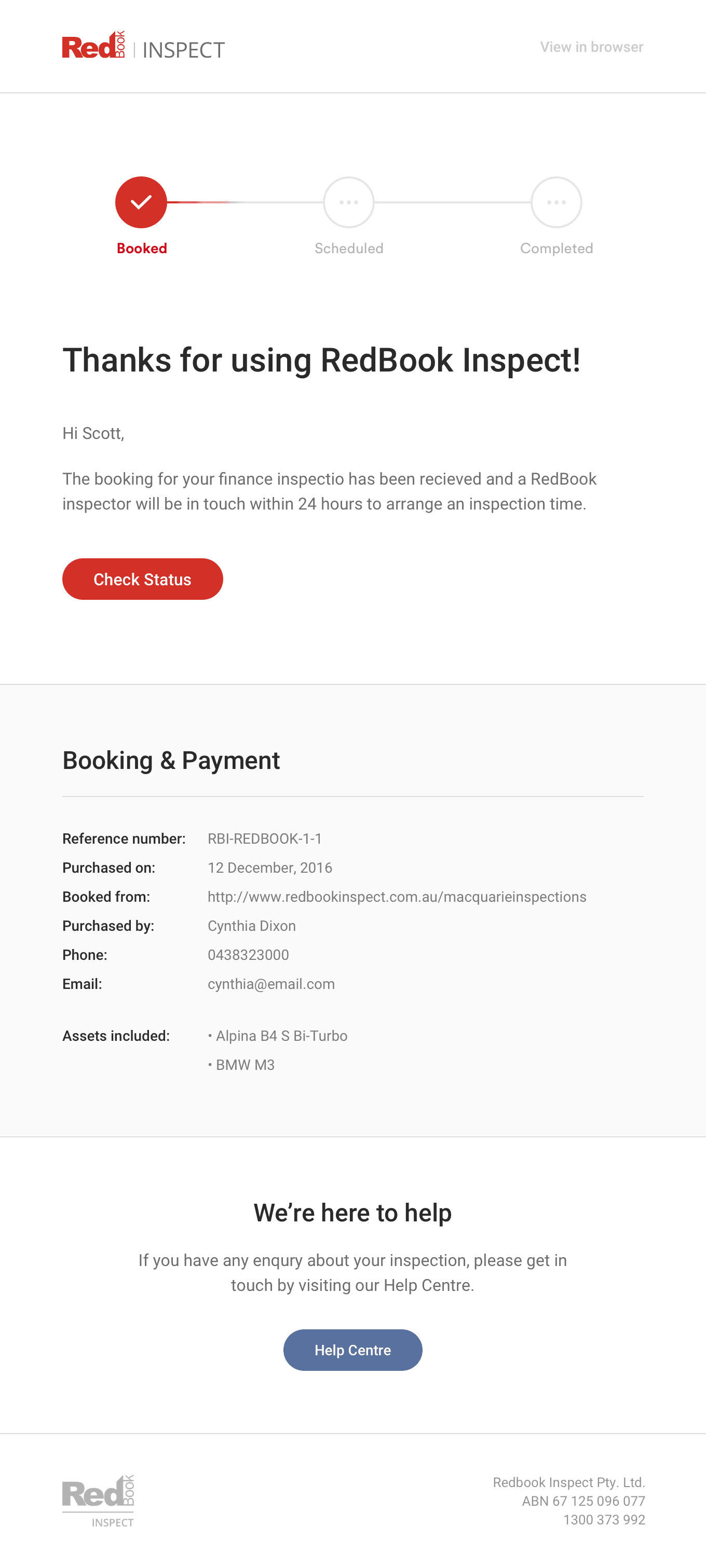
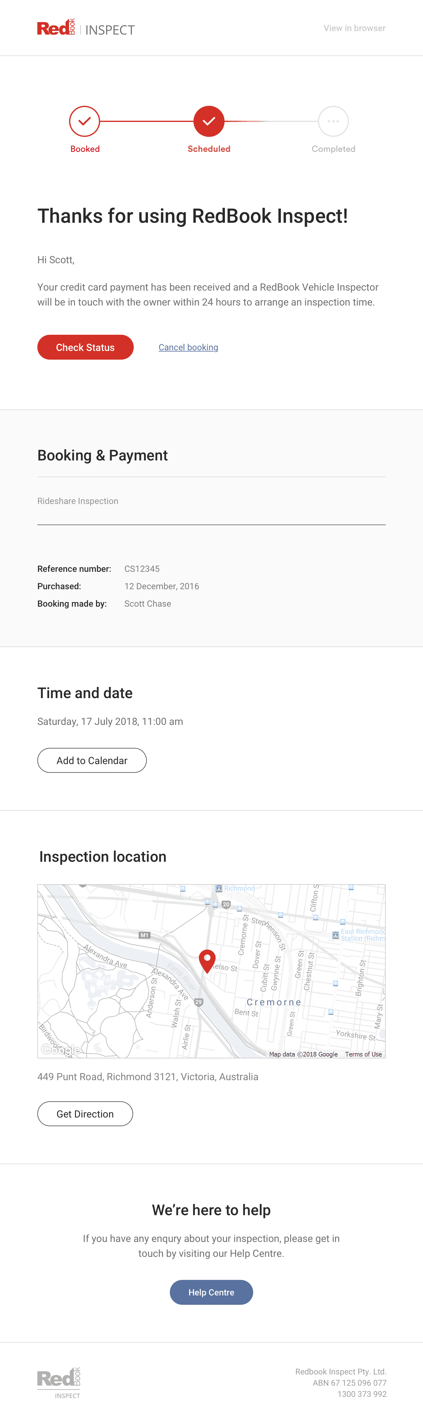
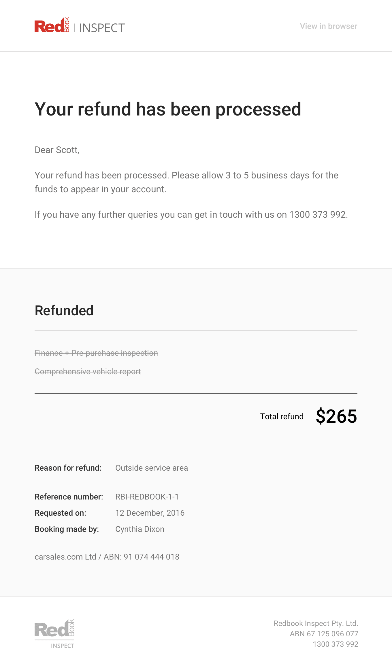
Updated email templates
Development
Email development is notorious for still relying on 1990s coding styles. However, there are many modern tools that make email development much easier and more straightforward.
I chose Foundation for Emails. It offered the Sass version we wanted and had excellent documentation.
---
subject: Your refund has been processed
invoice:
  title: Refunded
  refund: true
  items:
    - Finance + Pre-purchase inspection
    - Comprehensive vehicle report
  price:
    label: Total refund
    value: $265
  details:
    - label: 'Reason for refund:'
      value: Outside service area
    - space: true
    - label: 'Reference number:'
      value: RBI-REDBOOK-1-1
    - label: 'Requestedon:'
      value: 12 December, 2016
    - label: 'Booking made by:'
      value: Cynthia Dixon
  abn: 'carsales.com Ltd / ABN: 12 345 678 912'
---

<container>
  <!-- Header -->
  {{> header}}

  <!-- Body -->
  <row>
    <columns small="12">
      <spacer size="60" className="spacer60"></spacer>
      <h1>{{subject}}</h1>
      <spacer size="30" className="spacer30"></spacer>
      <p>Dear Scott,</p>
      <p>
        Your refund has been processed. Please allow 3 to 5 business days for
        the funds to appear in your account.
      </p>
      <p>
        If you have any further queries you can get in touch with us on 1300 373
        992.
      </p>
      <spacer size="60" className="spacer60"></spacer>
    </columns>
  </row>

  <!-- Refunded -->
  <hr />
  {{> invoice}}

  <!-- Footer -->
  {{> footer}}
</container>@import 'settings';
@import 'foundation-emails';
@import 'template/template';
/*Responsive Gutter*/
table.body td.columns, table.body th.columns{
@media only screen and (max-width: #{$global-breakpoint}) {
padding-left: 15px !important;
padding-right: 15px !important;
}
}
/*Responsive Spacer*/
// add classname spacer$i to <spacer> tag in your HTML (e.g. <spacer size="20" className="spacer20")
// choose numbers for $spacer based on what size spacer you need
$spacer: 10, 20, 30, 40, 50, 60;
@each $i in $spacer {
.spacer#{$i} td{
@media only screen and (max-width: #{$global-breakpoint}) {
font-size: ($i/1.5+px) !important; // reduces spacer in half on mobile screens, customize as needed
line-height: ($i/1.5+px) !important; // reduces spacer in half on mobile screens, customize as needed
height: ($i/1.5+px) !important; // reduces spacer in half on mobile screens, customize as needed
}
}
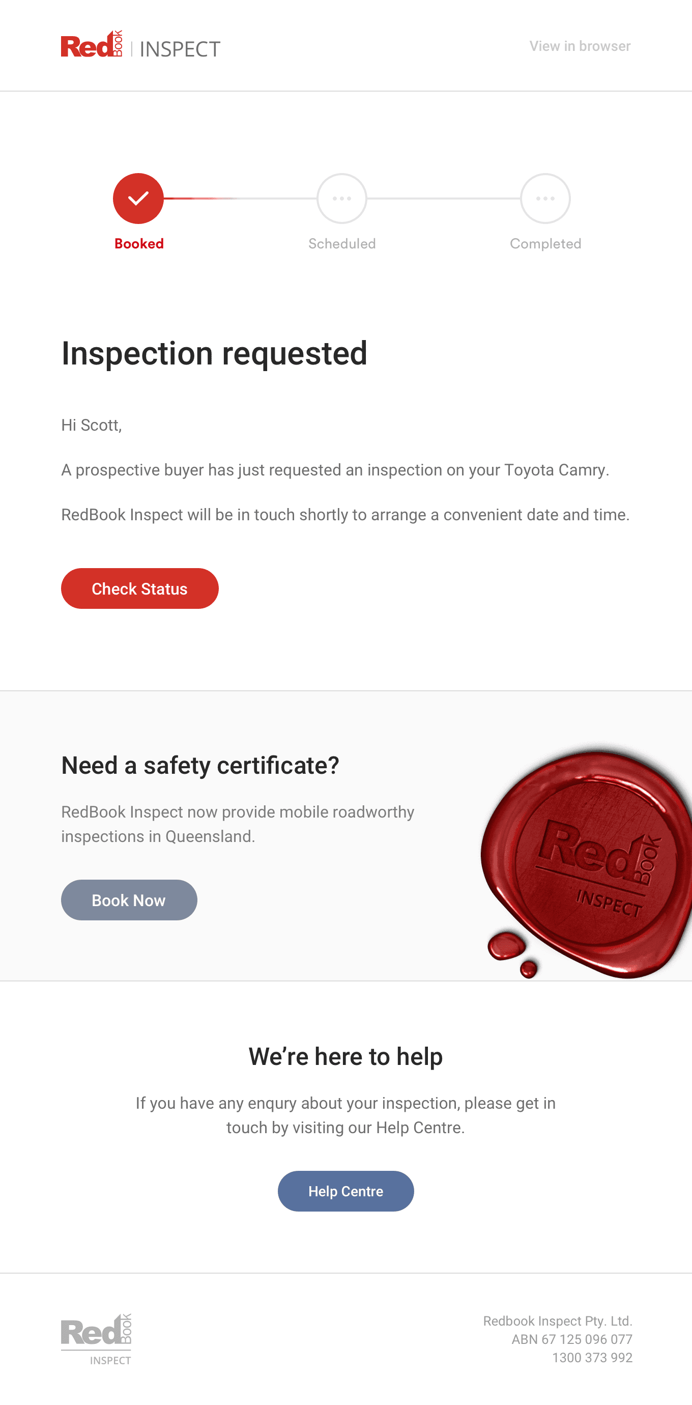
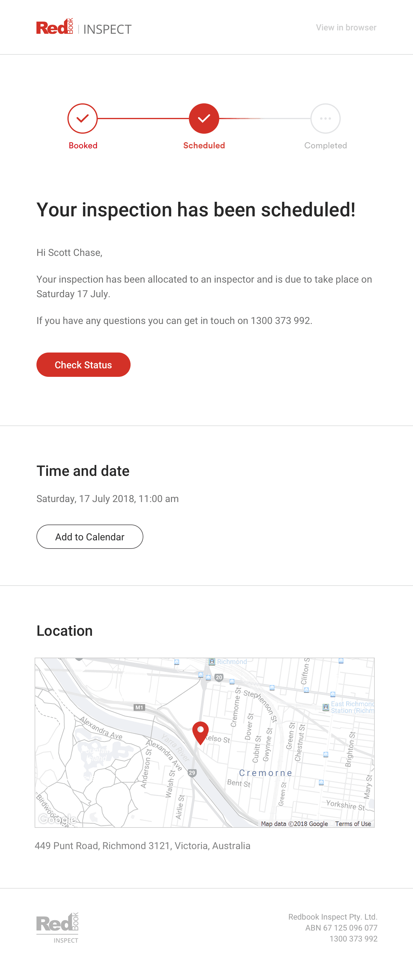
}I put a lot of effort into ensuring the actual emails matched my initial design exactly because the overall quality is always determined by the smallest details.